Chapter
III
How
Pictures Function in Print
Upon
mastering the basic principles of composition, the print journalist is left with
the task of applying them to practical problems of visual communication. “Form
follows function” is one of the most important rules of modern design, and in
determining the compositional form a visual message will take, analysis of
message function is an important first step. According to Click and Baird,
photographs and other illustrations in magazines usually function primarily in
one of five ways. They can (1) attract attention, (2) illustrate a point made in
the text, (3) tell a story with the aid of a caption, (4) tell a story in
sequence with other illustrations and (5) give visual relief to a design.1
Any one picture seldom will be classified exclusively in a single functional
mode. For example, it is possible to attract attention with a picture that also
gives visual relief to a graphic design. The function of a picture influences
all aspects of its final printed form, and until the source clearly understands
exactly what he or she wants a picture to do, it is impossible to determine
which of the rules of visual communication to apply.
Using
illustrations to attract attention
Before
perception of any message can take place at the conscious level, the attention
of the intended receiver of the message must be attracted. Schramm describes the
choice of mass communications to which an individual attends as being determined
by the “Fraction of Selection,” which is:
Expectation
of Reward
_______________________
Effort
Required
The
fraction means simply that one is more likely to select a given communication if
it seems likely to give more reward or require less effort than other
communications.2 As attractors of attention, illustrations often play
an important part in the reader’s unconscious evaluation of the fraction of
selection for a message.
A
picture used to draw attention to an article most often does so by conveying in
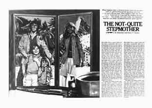
visual form the essentials of the verbal message. The illustration in Example 12
functions primarily as an attention-getter for an article titled “The
Not-Quite Stepmother,” which describes a study of the relationship between
divorced men with children and the women with whom those men become romantically
involved.
|
|
|
Example 12.
|
According to the accompanying article, “The not-quite stepmother is
not quite sure where she fits in—and neither is her lover.”3 This
uncertainty is conveyed visually both through picture content and through the
application of the Gestalt principles of proximity and closure.
At
first glance, a reader might perceive the illustration as a snapshot of a
typical family group, but some interesting incongruities prompt further
examination. The man and the children stand before a forest of tropical trees
while the woman is shown in what appears to be a separate snapshot against a
backdrop of snow-covered mountains. Yet the man and the woman are clearly shown
clasping hands as if they were part of the same picture. The physical proximity
of the man to his children expresses their wholeness as a family unit separate
from the woman, but through their similarity of size the man and the woman form
another whole separate from the children. In this way, the illustration
summarizes in visual form the dilemma of the not-quite stepmother: Her
involvement with the man, symbolized by the clasped hands and the similarity of
size, conflicts with the man’s relationship with his children, symbolized by
the incongruent backgrounds and the groupings based on physical proximity. This
visual summary of the article content thus attracts audience attention interest
and conveys the essentials of the article while demanding a relatively small
expenditure of effort.
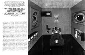
Another
attention-getting illustration accompanies an article titled “Why Some People
Seek Revenge Against Doctors.” (Example 13)
|
|
|
Example 13.
|
The illustration’s power to
attract attention is probably as great or greater than that of the picture in
Example 12, but It also seems probable that the picture compelled at least some
readers to avoid the accompanying article on medical malpractice suits because
of the eerie feeling of isolation the picture evokes. Dember and Earl warn that
the novelty of an attention-getting stimulus should not be so great as to
frighten or repel the observer by its abnormality or by the observer’s
inability to respond appropriately, nor should the stimulus be so complex as to
be beyond the observer’s understanding.4 In Example 13, there is an
overwhelming sense of lifelessness and inactivity in the picture which is
reinforced by the axial balance of visual elements. The use of the color green
for the walls, floor and hospital gown contributes a sense of coldness.
Converging parallel lines in ceiling and floor combine with the relatively small
size of the patient and hospital bed to give the room a cavernous appearance.
If
one reads the article accompanying Example 13, one finds little to justify or
explain the picture content. Certainly, there is some mention of patient
alienation about a third of the way into the article, but other
emotions--notably anger-are more heavily emphasized as characteristic of
patients who bring malpractice suits. Thus the picture attracts attention but,
because of its appearance could repel some readers or perhaps give them an
erroneous impression of article content.
Illustrating
a point made in the text
A
picture used to illustrate a text is intended to enlighten the reader by
clarifying points made in that text. Implicit in that use is the assumption that
words and pictures can complement each other in print communication. This
complementary relationship has as its basis certain differences in the way words
and pictures work. “In speaking,” writes William Bowman in Graphic
Communication, “one says not only what he wants to say but what his
language enables him to say.”5 All languages have inherent
limitations based on the symbols of the language itself and on how those symbols
function. The key to more effective communication in print is understanding the
complementary symbolic functions of verbal and visual languages.
Basically,
symbols work in either of two ways: analogically or digitally. In analogical
systems, the series of symbols is similar in proportions and relations to the
thing, idea or event it represents. Analogical symbol systems are continuous and
without gaps while digital systems are discontinuous and consist of clearly
distinguishable atomic categories that can be defined using other categories
from within the same symbol system. Words almost always function digitally while
pictures usually function as analogs. A word can be defined using other words,
but while pictures can be broken down into discrete elements, it is generally
impossible possible to assign precise definitions to those elements, either in
terms of other visual elements or in terms of words. This seeming lack of
precision should not be equated with an inability to convey meaning, for it is
this characteristic of visual language that enables image-makers to convey
messages that writers cannot.
“Words,”
writes Arthur Koestler, “are a blessing which can turn into a curse. They
crystallize thought; they give articulation and precision to vague images and
hazy intuitions. But a crystal is no longer a fluid.”6 This lack of
fluidity is the primary characteristic of words, or indeed of any digital symbol
system, that restricts the kinds of meaning digital symbols can convey.
“The
greatest power of visual language lies in its immediacy, its spontaneous
evidence,” writes Dondis. “Visually, you see content and form
simultaneously.”7 As Key points out, however, “the total
instantaneous perception of the picture is repressed in favor of certain
details. All the information and meaning are recorded instantly and totally, but
the mind plays what amounts to a trick, permitting only certain details--often
what we want to see or what we can identify with--to filter through into
conscious awareness.”8
Perception
of visual symbols appears, then, to operate on two levels simultaneously. On a
conscious level, the decoding of a visual message is similar to the decoding of
a verbal message in that the visual elements, like words, are sampled across
time, classified and duly recorded. While the eye scans the visual field and
focuses on specific aspects to be entered into conscious awareness, the
unconscious mind accepts and stores a single, instantaneous impression. This
instantaneous communications effect of visual symbol systems is unparalleled in
verbal systems.
Communication
at the unconscious level, while intriguing, is a highly controversial topic.
Little is known about how information stored in the unconscious influences
conscious attitudes and behavior,9 but that the influence is indeed
present is no longer widely disputed. At the conscious level, the observer sees
only what is necessary for meaning,10 even though he or she often
misinterprets and misunderstands messages because of this tendency to assign
meaning immediately. “We cannot say to ourselves, ‘Hold off any
interpretation until you collect all the facts.’ As soon as we experience any
facts, they will be perceived as organized into some sort of meaningful
whole.”11 This organization is referred to by psychologists as
“closure,” and one of the goals of the visual communicator is to control
closure by providing messages with the right amount of complexity for the
audience.
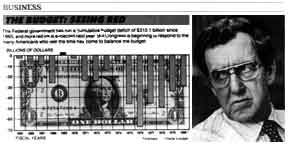
Perhaps
the most common example of text illustration with pictures is the use of
portraits or “mug shots” of people mentioned in the text. Graphs and charts
are also commonly used to clarify text by presenting a visual summary of
relationships, thus exemplifying the visual language at its least equivocal. The
various visual elements in a graph or chart are clearly understood to represent
data and in this sense, such pictures may be said to function digitally in much
the same way words to. Their illustrative value lies in their ability to
function simultaneously as analogs by instantaneously summarizing the
relationships among the digitally presented data as in Example 14, in which
factual information is conveyed at the same time relationships and trends are
communicated. Note also the use of the mug shot for illustration.
|
|
|
Example 14. Factual information is conveyed at the same
time relationships and trends are communicated.
|
Telling
a story with a single picture
In
discussing the use of a single picture to tell a story, Click and Baird write
that “the possibility of a single photograph telling a story or making a point
without the aid of any words is so rare as to merit elimination from the list of
possibilities.”12 Implicit in this statement is the authors’
ill-conceived denial of the very real tendency of all pictures to convey a
message of some kind to anyone who perceives them. Indeed, by defining the word
“story” rather broadly, one can safely assert that every picture tells a
story, provided the picture’s perceiver believes the picture to be potentially
meaningful.
According
to Gordon, “The conscious attempt to create a seemingly ‘sensible’ field
around ourselves is probably one of the strongest of our drives.”13
Because of this need for meaning, an un-interpreted picture creates a conflict
in a perceiver that can be resolved only through his or her interpreting that
picture. Ideally, the perceiver’s interpretation of a picture corresponds as
closely as possible with the meaning intended by the source, but if a perceiver
misunderstands the sender’s intentions, according to Gordon,
the
perceiver usually resolves his confusion by searching into his own
predispositions to find hidden meanings. He thus introduces his own opinions,
prejudices, attitudes and beliefs into an ambiguous field, with the result that
he believes that he has cleared up his confusion. He has not. He has simply
succeeded in eliminating the psychological tension that in-variably results when
an individual faces chaos in his perceptions.14
It
is important to note Gordon’s reference to “an ambiguous field,” for the
breadth of audience Interpretation of any message is determined primarily by the
degree of ambiguity in that message. Because visual communication is inherently
more equivocal than verbal communication, print journalists can effectively
narrow the range of interpretations for any one picture by providing their
audiences with a supporting verbal message, usually in the form of a caption.
The extent to which captions can influence picture interpretation was explored
during the 1950s by Kerrick who presented her conclusions in an article for Journalism
Quarterly. Kerrick’s research suggested that a caption can modify picture
interpretation in ways that can be predicted by the writer of the caption, but a
caption that is in obvious conflict with picture content will most often be
rejected.15 Thus, as Kerrick’s findings indicate, words can guide
picture interpretation only so long as their message appears to be consistent
with the picture’s message.
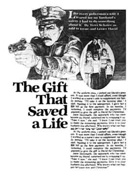
In
some oases, a certain degree of ambiguity may be desirable because an ambiguous
picture often attracts the attention of the observer and encourages his or her
participation in the communications process through filling in blurred or
missing parts. According to John Cataldo, “Distortions are designed to attract
the attention of the reader and invite his participation, much in the same
manner that a tipped picture on a wall invites the viewer to reestablish its
balance.”16 Thus, if the source wants to encourage reader
participation, perhaps at the expense of clarity and specificity, then he or she
may select a relatively abstract or ambiguous photograph or drawing as in
Example 15, wherein lack of detail, particularly in the family grouping,
encourages reader identification with characters in the accompanying story.
|
|
|
Example 15. Lack of detail encourages reader
identification with characters in the story.
|
The
calculated use of ambiguity in visual communication is not to be confused with
the ambiguity that results from the source’s inability to express visual ideas
clearly. Similarly, ambiguity is not to be equated with lack of detail. In
conveying factual information, the mechanical exactness of a photograph may seem
ideal, but often a drawing can convey meaning more clearly by presenting only
relevant information.17 It was found, for example,, that realistic
photographs of organs did not help students understand a medical lecture while
cartoon-like drawings helped significantly.18 Often it is useful to
use both detailed and simple illustrations. In Example 16, photographs show in
detail a project’s final appearance while drawings clearly demonstrate how it
is to be constructed.
|
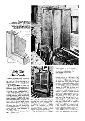
|
|
Example 16. Detailed photographs show final appearance of
a project while drawings show essentials only.
|
Telling
a story in sequence with other pictures
Although
a single picture can tell a complete story, its communicative potential is often
enhanced when it becomes part of a picture sequence. Perhaps the most common
sequential use of pictures is for how-to articles in which a step-by-step
process is explained in word and picture form as in Example 17.
|
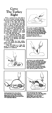
|
|
Example 17. A picture sequence shows a step-by-step task.
|
Pictures in
sequence also help tell the before-after story of a Texas town’s renovation in
Example 18, while in Example 19, a series of three pictures showing a sunrise
conveys a symbol of optimism in visual form.
|
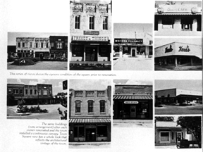
|
|
Example 18. A before-after sequence.
|
|
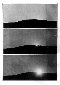
|
|
Example 19. A sequence of pictures conveys a sunrise.
|
As these examples show, an
individual picture in a sequence has a better chance of being interpreted as the
source meant it to be than does that same picture appearing alone because of the
tendency of other pictures in the sequence to help clarify the source’s
intentions.
Giving
visual relief to a design
“The
weakest reason for using illustrations,” say Click and Baird, “is for
decoration, but there are instances when this motive alone provides adequate
justification.” 19 Masses of type can be forbidding to some readers, so by
breaking up solid type areas with appropriate illustrations, editors make
articles seem more inviting. Illustrations functioning as decoration need not
convey actual information, but they should appear to be in harmony with the
message as a whole. The recipe page in Example 20 is decorated with drawings
that contribute to the communications effort by making the page more attractive.
The informative function of such pictures, however, is minimal.
|
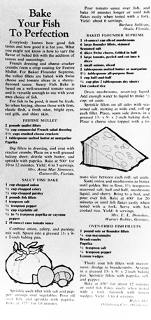
|
|
Example 20. Drawings decorate the page and provide visual
relief but convey little information.
|
Summary
How
the basic principles of visual communication are to be applied depends primarily
on the specific functional goals of the message. Pictures most often function
primarily to attract attention, to illustrate a point made in the text, to tell
a story with the aid of a caption, to tell a story in sequence with other
pictures or to give visual relief to a design.
Notes
from Chapter III
1J.
W. Click and Russell N. Baird, Magazine Editing and Production (Dubuque,
IA: Wm. C. Brown Company, 1979), p. 151.
2Wilbur
Schramm, ed., The Process and Effects of Mass Communication (Urbana, IL:
University of Illinois Press, 1961), p. 19.
3Kristine
M. Rosenthal and Harry K. Keshet, “The Not-Quite Stepmother,” Psychology
Today, 12, No. 2 (July 1978), p. 83.
4Vernon,
p. 71.
5William
J. Bowman, Graphic Communication (New York: John Wiley and Sons, Inc.,
1968), p. 3.
6Arthur
Koestler, The Act of Creation (New York: The Macmillan Company, 1969), p.
173.
7Dondis,
p. 106.
8Wilson
Bryan Key, Subliminal Seduction (New York: Signet, 1973), p. 52.
9Ibid.,
p. 61.
10Carolyn
M. Bloomer, Principles of Visual Perception (New York: Van Nostrand
Reinhold Company, 1976), p. 44.
11David
Krech and Richard S. Crutchfield, “Perceiving the World,” Theory and
Problems of Social Psychology (New York: McGraw-Hill, 1948), p. 120.
12Click
and Baird, p. 155.
13Gordon,
p. 204.
14Ibid.,
p. 218.
15Jean
S. Kerrick, “The Influence of Captions on Picture Interpretation,” Journalism
Quarterly, 32:177-182 (1955), p. 182.
16John
W. Cataldo, Graphic Design and Visual Communication (Scranton, PA:
International Textbook Company, 1966), p. 42.
17Arnheim,
p. 157.
18John
M. Kennedy, A Psychology of Picture Perception (San Francisco: Jossey-Bass
Publishers, 1974), p. 145.
19Click
and Baird, p. 155.
© 1980 by Gretchen Kerry
Nesbit