Chapter
II
The
Basics of Visual Communication
For
the print journalist, the ability to create a meaningful visual
message depends in part on learning about basic compositional
elements and their interactions. The basic elements of a visual
message are point, line and shape. These elements generally have
characteristic visual weight and direction. To control weight and
direction effectively, visual communicators often adhere to
principles of perceptual organization first described by the Gestalt
psychologists. Borrowing from the literacy analogy, a basic
knowledge of these elements of composition and their interactions is
comparable to knowing the alphabet, a few simple words and some
elementary rules of syntax.
Point,
line and shape
The
point is the simplest, irreducibly minimum unit of visual
communication. According to Dale G. Cleaver, “Line may be thought
of as the path of a moving point, as the edge of a flat shape, as
the axis (dominant direction) of a shape, or as the contour of a
solid object.”1 A shape is an area or plane with
distinguishable boundaries and, as Cleaver explains, “Shape, like
line, may have many personalities: rigid, flexible precise,
uncertain, calm, active, awkward, or graceful.”2
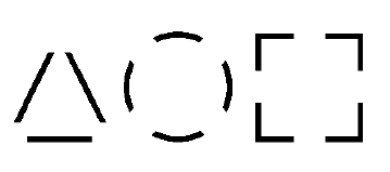
The
three basic shapes are the square, associated with dullness, honesty
and straightness; the triangle, associated with action, conflict and
tension; and the circle, associated with endlessness, warmth and
protection.
In
composing a picture or designing a page, it is generally desirable
to strive for balance. Equilibrium is man’s firmest and strongest
visual reference3 and, according to Rudolf Arnheim,
“man strives for equilibrium in all phases of his physical and
mental existence.”4 The various compositional elements
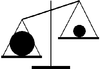
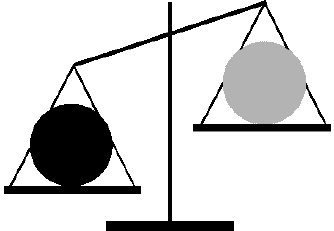
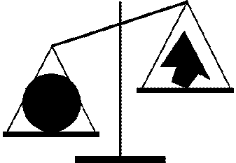
have characteristic visual weights determined primarily by their
size, tone, shape, color, location on the visual axes and subject
matter. These relationships are summarized in Table 1 and
illustrated by the author in Figures 1 through 6.
|
|
Heavy
|
Light
|
|
size
|
large
|
small
|
|
tone
|
dark
|
light
|
|
shape
|
regular
|
irregular
|
|
color
|
warm
|
cold
|
|
location
|
off
axis
|
on
axis
|
|
subject
|
high
interest
|
low
interest
|
|
Table
1. Determinants of Visual Weight
|
|
|
|
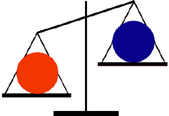
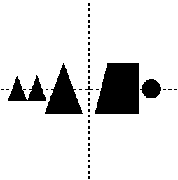
Figure
1. Size as a determinant of visual weight
|
|
|
|
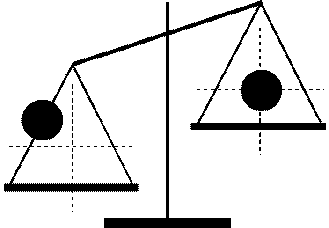
Figure
2. Tone as a determinant of visual weight
|
|
|
|
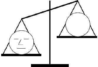
Figure
3. Shape as a determinant of visual weight
|
|
|
|
Figure
4. Color as a determinant of visual weight
|
|
|
|
Figure
5. Location as a determinant of visual weight
|
|
|
|
Figure
6. Subject as a determinant of visual weight
|
It should be
emphasized that these are relationships, not absolutes, and that the
various factors can interact. For example, a large visual element
may be balanced against a high-interest subject, or an element
placed on one of the visual axes may be balanced by a warm-colored
off-axis element. In any case, unless the specific effect of
imbalance is desired, compositions should ultimately resolve into a
balance.
Cleaver
writes:
Balance
may be axial, that is, organized on either side of an actual
or implied axis that acts as a fulcrum, or central, that is,
radiating from or converging upon an actual or implied central
point. Axial balance may be obvious (symmetrical), having
very similar or identical elements on either side of the axis, or it
may be occult (asymmetrical), having an equilibrium of
elements that are dissimilar in size or shape. Central balance may
also be obvious with similar elements in equilibrium around a
center, or occult, using dissimilar elements.5
Some
of the most important techniques of balance are illustrated in
Figures 7 through 10 (adapted from Cleaver) and Examples 1 through
3, taken from recent issues of various popular magazines.
|
|
|
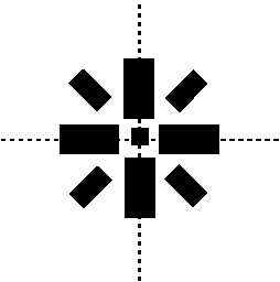
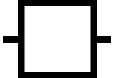
Figure 7. Axial balance achieved symmetrically
|
|
|
|
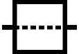
Figure 8. Axial balance achieved asymmetrically
|
|
|
|
Figure 9. Central balance achieved symmetrically
|
|
|
|
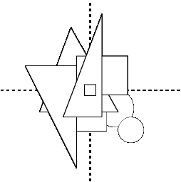
Figure 10. Central balance achieved asymmetrically
|
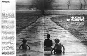
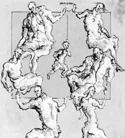
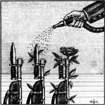
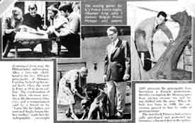
In Example
1, notice how each visual element on the left page of the spread is
symmetrically balanced against an element on the facing page.
Example 2 achieves asymmetrical balance with the visual weight of
the two children near the center balanced against that of the boy to
the left whose weight is increased by his distance from the vertical
axis. Visual elements are balanced around a central figure in
Example 3.
|

|
|
Example 1. Symmetrical axial balance.
|
|
|
|
Example 2. Asymmetrical axial balance.
|
|
|
|
Example 3. Central Balance.
|
Movement
According
to art historian and theorist E. H. Gombrich, movement always helps
confirm or refute provisional interpretations or anticipations of
visual messages and, for that reason, reading of static images is
prone to large variations and contradictory interpretations.6
The print journalist is confined to static images and, as a
consequence, confronts problems similar to those described by
Gombrich. It is possible, however, to give the impression of
movement in a static image. As Cleaver explains, “To suggest or
emphasize movement, …line may be used in at least two ways: It may
represent or suggest things we know are capable of motion, such as
rippling waves, or it may imply motion by its form or by its
relation to other lines.”7 Shapes, too, can have
characteristic motions. Cleaver writes, “Static shapes maintain a
rigid equilibrium within themselves and with their environment.
Shapes become more dynamic as they draw our attention in a specific
direction.”8
Besides
the implied physical activity of visual elements, the term
“movement” is also used to describe the activity of the
viewer’s eye as it is affected by those visual elements. According
to Dondis, the visual directions have strong associative meanings.
Horizontal-vertical movements are associated with well-being and
maneuverability because of man’s overriding need for equilibrium.
Diagonal movements imply instability, and are provoking and
threatening. Curved movements give the feeling of encompassment,
repetition and warmth.9 Again, it must be noted that
these phenomena are not absolutes, but are very much related to the
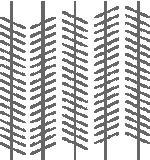
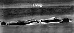
visual contexts in which they appear. Properties of movement are
illustrated in Examples 4 through 7. In Example 4, dotted lines
suggest water’s movement. Parallel lines appear to move out of
alignment because of their relation to the diagonal lines. The
strong horizontal line created by the two snorkelers in Example 5
conveys rest and stability while the diagonal lines of the man’s
body and the net in Example 6 suggest activity and stress. In
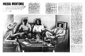
Example 7, circular eye movements from face to fact and to objects
on the table convey encompassment and warmth.
|
|
|
|
Example 4. Dotted lines suggest water’s movement.
Parallel lines appear to move out of alignment because of
their relation to the diagonals.
|
|
|
|
Example 5. Horizontal-vertical eye movements convey
rest, stability.
|
|

|
|
Example 6. Diagonal eye movements convey activity,
stress.
|
|
|
|
Example 7. Circular eye movements convey
encompassment, warmth.
|
Gestalt
principles of organization
In
addition to being influenced by the inherent visual weight and
direction of visual elements in a composition, the viewer’s
response is influenced according to innate tendencies of visual
organization first described by the Gestalt psychologists. In
explaining Gestalt theory, psychologist M. D. Vernon writes,
“There exists an inherent tendency to organize what is perceived
into configurations…. Organization takes place in
accordance with the Law of Prägnanz, (‘goodness’), which
states that configurations tend to appear as clear, impressive and
stable as possible.”10 To this definition, Arnheim
adds, “Any stimulus pattern tends to be seen in such a way that
the resulting structure is as simple as the given conditions
permit.”11 People simplify visual stimuli in several
predictable ways. The Gestalt principles are descriptive of these
common ways of organizing, The four most important principles of
visual organization are those of similarity, proximity, closure and
good continuation.
According
to the principle of similarity, when two elements resemble each
other in some way, such as size, weight, form, color or structure,
the similarity will create a visual attraction across intervening
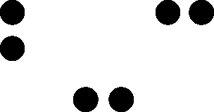
space, The principle of proximity is defined as a tendency to see
elements that are close together as belonging together. According to
the principle of closure, there is a tendency to create a unified
mass through the association of isolated elements and to shape
optical units into closed, compact wholes whenever possible. The
principle of good continuation is described as a tendency to see
lines and edges as uninterruptedly as possible, and when there is a
choice between several possible continuations of lines, hues, tonal
values or chroma, to prefer spontaneously the one which carries the
intrinsic structure most consistently. These four basic Gestalt
principles are illustrated by the author in Figures 14 through 19
and in Examples 8 through 11.
|
|
|
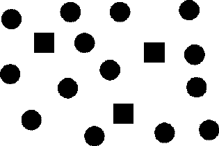
Figure 14. Similarity of Shape
|
|
|
|
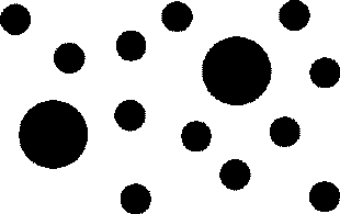
Figure 15. Similarity of size
|
|
|
|
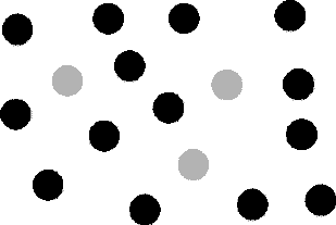
Figure 16. Similarity of color
|
|
|
|
Figure 17. Proximity
|
|
|
|
These lines tend to be organized into figures.
|
|
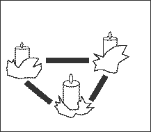
Figure 18. Closure
|
|
|
|

|
|
This is seen
|
as this
|
not this.
|
|
Figure 19. Good continuation
|
|
|
|
|
|
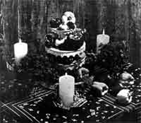
Example 8. Similarity of
shape
|
Because of their similarity of shape,
the three candles in Example 8 tend to be grouped together.
|
|
|
Example 9. Proximity.
|
In
Example 9, the proximity of the two upper pictures makes readers
tend to pair them while seeing the picture to the lower right of the
page as unrelated to the other two.
|
|
|
Example 10. Closure.
|
|
|
|
Example 11.
|
Closure makes readers see the
areas defined by dotted lines in Example 10 as complete forms while
good continuation makes the pictures in Example 11 appear to be
lying on top of each other rather than appearing oddly shaped.
Summary
The
basic elements of a visual message are point, line and shape. These
elements generally have a characteristic visual weight determined by
size, tone., shape, color,, location on the visual axes and subject
matter, a visual direction determined by shape and subject, and a
characteristic visual movement determined by shape and eye motions.
To control weight and direction effectively, visual communicators
often adhere to various principles of organization first described
by Gestalt psychologists. The most important of these principles are
those of similarity, proximity, closure and good continuation.
Notes
from Chapter II
1Dale
G. Cleaver, Art: An Introduction (New York: Harcourt Brace
Jovanovich, Inc., 1972), p. 4.
2Ibid.,
p. 8.
3Ibid.,
p. 22.
4Rudolf
Arnheim, Art and Visual Perception (Berkeley, CA: University
of California Press, 1974), p. 36.
5Cleaver,
pp. 20-21.
6E.
H. Gombrich, Julian Hochberg and Max Black, Art, Perception and
Reality (Baltimore: The Johns Hopkins University Press, 1972),
p. 32.
7Cleaver,
p. 6.
8Ibid.,
p. 10.
9Dondis,
pp. 46-47.
10M.
D. Vernon, Perception Through Experience (London: Methuen and
Company, Ltd., 1970), p. 35.
11Arnheim,
p. 53.
© 1980 by Gretchen Kerry
Nesbit